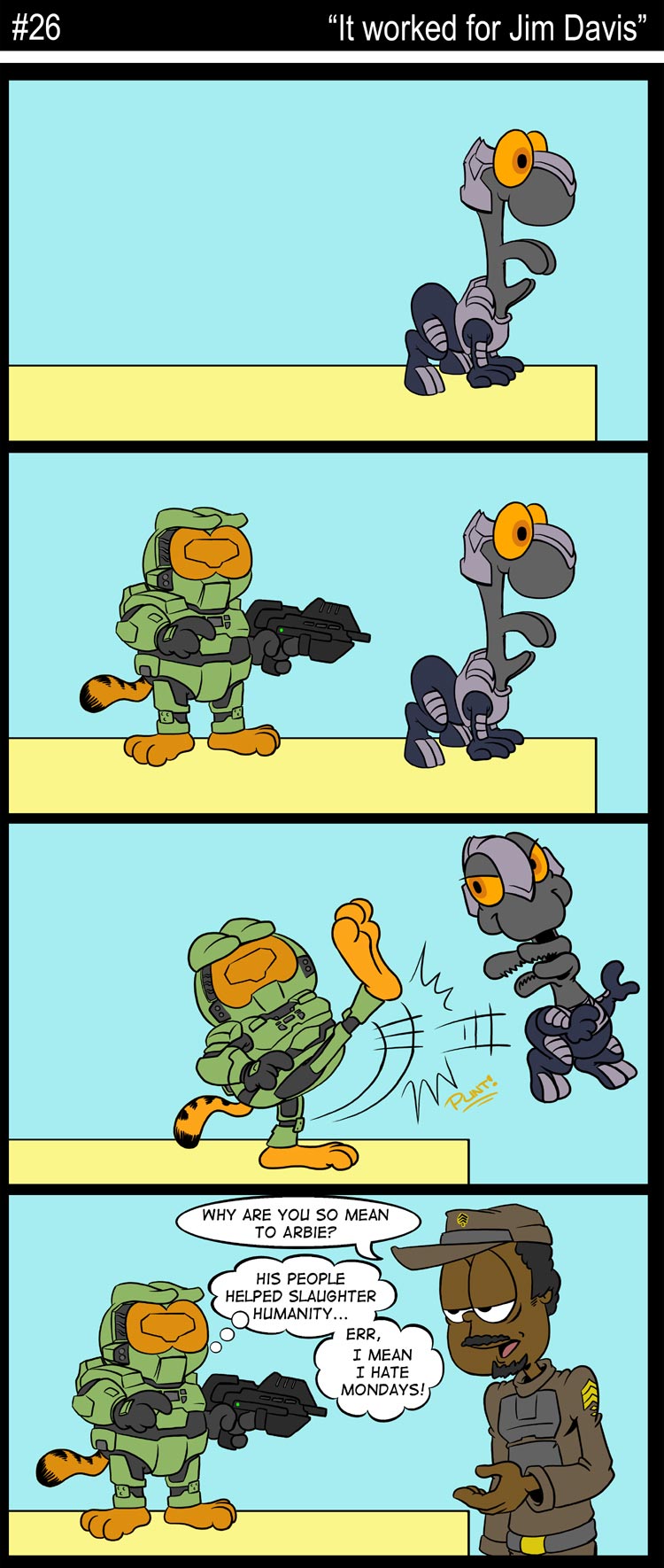
A LITTLE HELP?
I'd like to ask a serious question for the people who like to offer feedback and critiques.
What I'm curious to know, is how well the dialogue bubbles read. While this particular strip isn't a good example, normally I give each character a special color, style, or font for their individual speech balloons. (Purple for the Arbiter, Blue for Cortana, etc)
Doing that allows me to have less of the arrows pointing at each characters head throughout the comics. I would like to know if this is a problem for people, or if it comes across as easy to read. SPAWN comics used that same technique and I always thought it helped things really stand out.
Thanks in advance to any who offer their comments. I really do appreciate it. :)
ABOUT THE 'NADES
Someone wanted to know what names I decided to assign to the Grenades from number 24. I think I'm gonna go with Doug and Bob. I wanted to avoid Bob because that's my dad's name, but naming them after the McKenzie bros. was a stroke of genius.
And I like the idea of Can-NADE-ian Plasma Grenades. So kudos to Phaedrus for suggesting it. (If I had come up with it, it would be a comic strip gag by now/lol) Although I must say, all the suggestions were very creative and thanks to everyone who took the time to chime in. That strip got a record 30 comments, the most feedback yet!
UPDATE, FROM LOUIS WU, 6 DEC 07
ZZoMBiE13 was inspired by my news post to create this masterpiece (1440x900, 179k) - he totally rocks. My day has been made.


